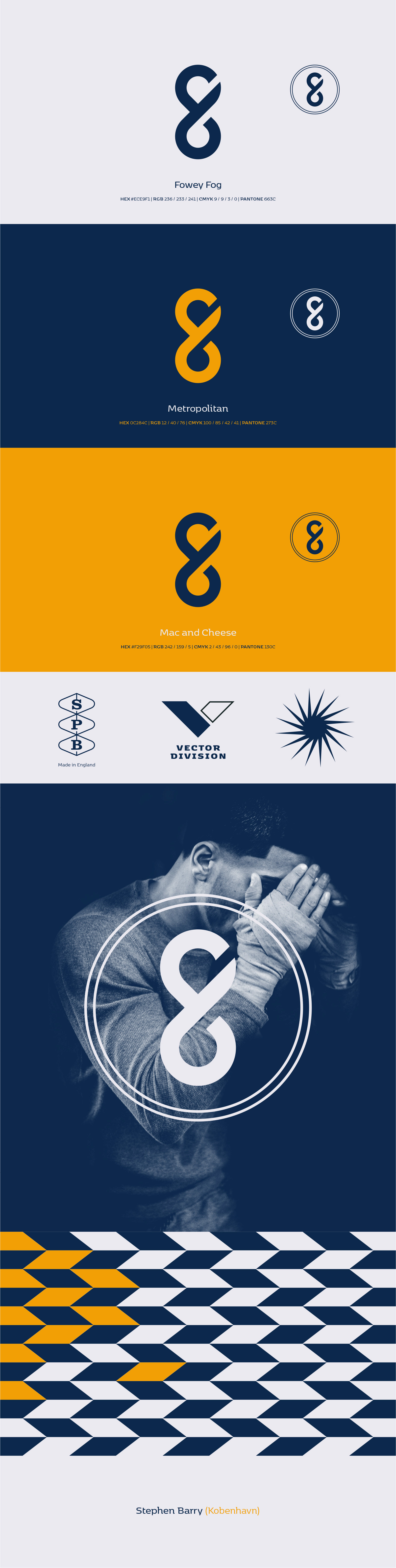


The logomark is a considered update to a previous iteration. Concentrating on clarity, with a conscious decision to create a flat design which would work across both print and digital applications. I decided to forego a word mark, opting simply for the monogram. With the absence of a word mark, careful consideration was given to font selection. I decided upon Kobenhavn, a dynamic font designed by Morten Rostgaard Olsen from Fontpartners. The letterforms work beautifully for both headlines and body copy. Combined with original imagery, Kobenhavn sits comfortably to create unique layouts and deliverables stemming from my personal branding. The colour palette was carefully curated and draws influence from things of importance in my personal life.